KHNP President Hwang Joo-ho Visits E2S and Pledges Closer Communication

Hwang Joo-ho, President of Korea Hydro & Nuclear Power, visited partner company E2S and said the company would continue to communicate closely and cooperate with businesses across the nuclear industry. The visit to E2S headquarters in Hwaseong, Gyeonggi-do marked his first major industry outreach activity of the year.
E2S, founded in 1993, is a Korean engineering company specializing in digital generator excitation systems and holds leading core technologies for nuclear and hydro power plant control systems.
During the visit, President Hwang reviewed E2S's key technologies and demonstration equipment, including design technologies for large-capacity generator excitation systems and controllers for nuclear control rod drive power cabinets.
CI System
The E2S CI is a brand asset that visually conveys technical completion, user-friendly clarity, and a future-facing sense of connectivity across data, technology, and people.
Brand Principle
Core values expressed through the CI
The E2S brand is built around precision engineering, scalable connectivity, and a stable sense of balance.
Technical Completion
Soft curves and angular geometry work together to express technical completion and a precise corporate image.
Connectivity
The flow between E, 2, and S symbolizes scalable connectivity where data, technology, and people form one network.
Balanced Identity
Stable proportions and restrained design create balance while reinforcing a dependable corporate impression.
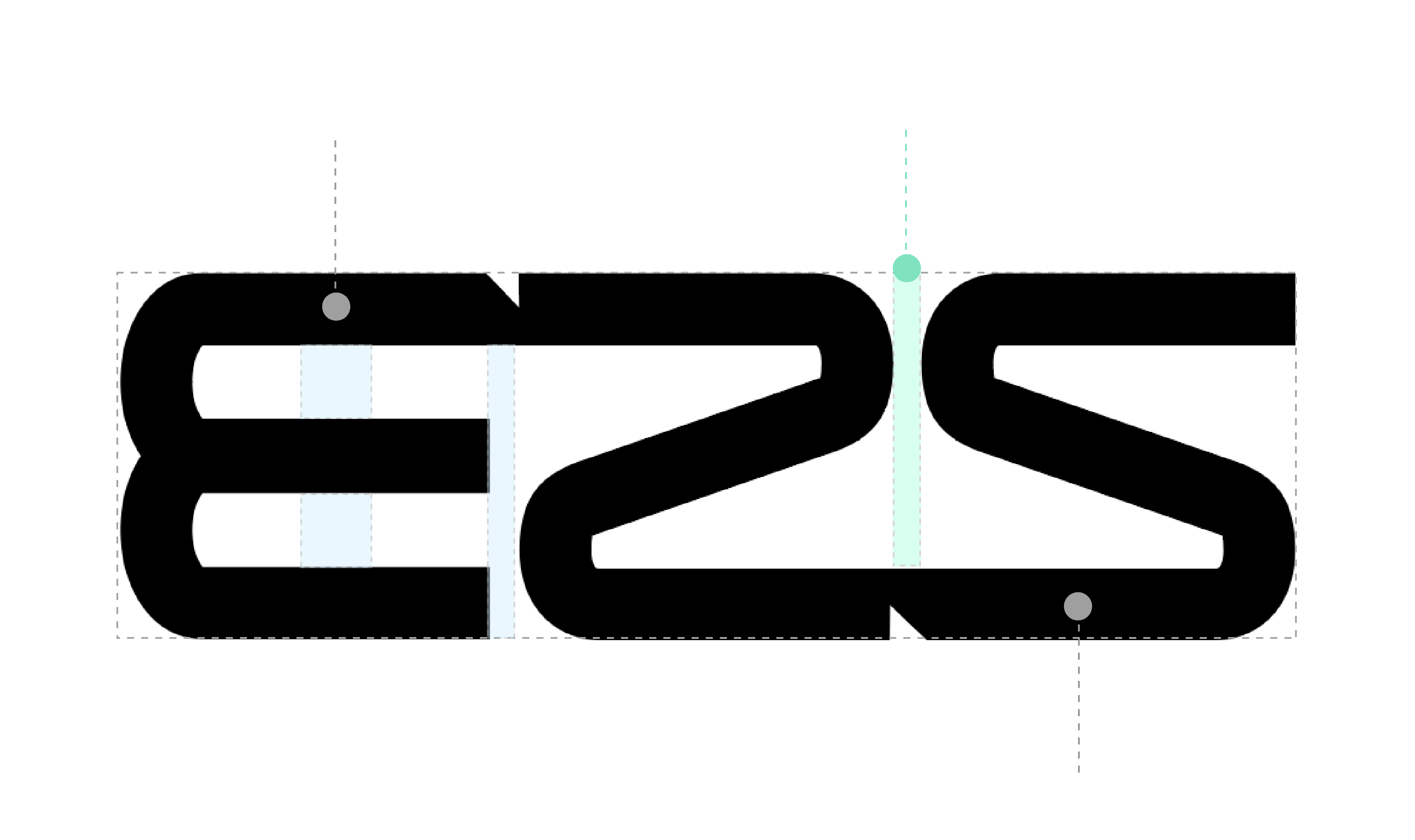
Word Mark
Wordmark breakdown
Word Mark
- The interaction of internal and external curves with angular forms represents both technical precision and user-friendly accessibility.
- E, 2, and S connect naturally to create visual flow, expressing scalable connectivity and a future-oriented network of data, technology, and people.
- Its stable and modern structure preserves visual balance and strengthens a solid, trustworthy brand image.
Logo System
Logo usage system
In practical use, maintain enough contrast and clear space according to the background and medium to preserve consistency.
- Use the primary logo on bright backgrounds.
- Always secure sufficient clear space around the logo.
- Do not arbitrarily alter the proportion, spacing, or shape.
- Use the inverse logo on dark backgrounds.
- Avoid placing it directly on visually complex imagery.
- Apply it only where contrast is clearly secured.
Color System
Brand color system
Primary and neutral tones are used together to maintain a technology-driven sense of trust and a modern brand impression.
Primary Colors
E2S Green
Deep Black Navy
Secondary / Neutral
Soft Gray
Soft Mint Tint
Primary
Key visuals, highlighted text, and emphasis points
Neutral
Card backgrounds, separators, and informational layouts
Contrast
Wordmark usage, body copy, and high-contrast areas
Application
CI application examples
The same rules can be applied across websites, signage, documents, and proposal materials.
Website
A white-based layout with rounded boxes and restrained brand color usage reinforces professionalism.
Documents / Proposals
Reports, company profiles, and proposals use the same typography and color system to maintain brand consistency.
Signage / Business Cards
Even in offline touchpoints, clear space and contrast are preserved to deliver a crisp and reliable brand image.